So as requested by my Instagram friend and fellow British Columbian,
micerule934, I have comprised a list of the five worst base sets of this millennium. I rated these critiquing photography, card design, and back info. I only chose sets that I had cards of in my collection, so unfortunately, I could not include this year's
Full Force. So for my reviews, I've chosen one card from each set that I can analyze and point out common things that I find wrong with the majority of the set. Without further adieu, I present to you, the worst base sets of the 21st century.
#5: 02-03 Upper Deck Vintage
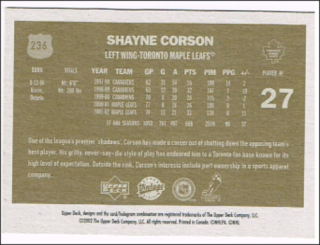
Right off the bat, we can see that the background removal tool was used impeccably with these photos of Shayne Corson. I really don't see the purpose of using two photos at all actually, and because neither of these are action shots, as are many in this set. I've never liked up close photos on cards, unless they're actually meant to be posing, because it is generally unflattering. Another problem I have with these cards is that there is a white border, fine, but there's also an internal black border, which makes the card seem small.
Now on the back, it's all nicely organized but you'll see that in the height/weight section of info, it's a category known as "vitals." Vitals? Really? The card really could have done without labels for the non-statistical info such as "Born," "Vitals," and "Player #." I also find amusing the way the card describes Toronto's fan base as having "high levels of expectation." Oh Toronto...
#4: 08-09 Be A Player
Let's start off with design. It looks like a cheap promotional giveaway that the Canucks, at least, would do for
Jeans Day. Obviously, there is no mention of jeans on the card, but the overly simple border and font make one believe that it is a wannabe Upper Deck brand card. I mean, even the logo is somewhat out of place, because it looks like a charity brand. Behind the nicely cropped main photo is.. the same photo. Except it's not cropped so one can see the very reason that the main photo was cropped in the first place... the boring background featuring bored fans. Likely they are bored because almost none of the pictures in this set are action shots.

On the back, the simple design is kept up, although with a bit more colour, which is nice. However, the card only features five lines of stats which is common, but what about all that space above? I mean, they literally just filled it with the EXACT same picture from the front, which means that the picture was featured THREE times on this card! It's also zoomed in to fit in the massive amount of space they have, which makes it a little blurry.
#3: 14-15 O-Pee-Chee
The colours. Sometimes they actually match the team, but mostly, there is absolutely no reason why the colour is featured. "Hey, Andrew MacDonald plays for the Flyers, so let's make the colour of the border purple!" Also, like UD Vintage, there's an additional white border on the outside. Also, none of the pictures in this set are action shots. The fan in the background here is justifiably bored.
It also doesn't help that all of the cards have the team name on the front... Except Nashville, Winnipeg, and Colorado, because...reasons? Which also brings to mind the fact that the team names change sizes to fit in the bottom, which isn't a big deal, but may annoy some.
On the back, it's not certain whether Upper Deck is trying to recapture the old charm of O-Pee-Chee or give it a modern identity. The plain cardboard background is there (which makes it somewhat difficult to read the stats) but where is the player
blurb that was so interesting on old OPC? Also, the back picture is tiny.
#2: 04-05 SP Authentic
At first glance, this card is decent, maybe a little disorganized-looking with the info kind of all over the place, resembling
94-95 Fleer. However, unable to be seen through this scan is something that may haunt your dreams. Turn down the brightness and...
There it is. Just a face in the background. It's not just David Aebischer, by the way, this does happen with all of the other cards.
On the back, we can see that perhaps
Google Gravity may have been used in the design. The stats are sideways, the player blurb is upright, and oh dear, there's the face again, in the top left, although this time Upper Deck just decided to include the one eye. Now that is creepy.
#1: 14-15 Upper Deck
Now, for this set, I have decided to showcase more than one card, because there are so many bad pictures in this set. The design is simple and small, saving room for the terrible photography. There are almost NO action shots, but fear not, there are many shots of...
Players coming on the ice
Players off the ice completely
Players before the action
Players after the action
But mostly, it's just players skating around.
I feel you bro, I feel you.
I mean, they even managed to get the goalies just skating around!
Now the back design is actually quite nice... however in the blurbs we get lovely reminders of (left to right) days way WAY gone by, insignificant games, how Colorado brutally choked in the '14 playoffs, and how Jiri Hudler was shamefully snubbed off of the 2014 Czech Olympic roster.
So those are my thoughts on the worst sets of the 21st century, what are yours? Tell me in the comments! Thanks for reading, and follow to keep updated for more hockey card posts!


